[Do you like this? Please subscribe to my YouTube Channel and then share it for me!]
Video Summary
According to Google, a key consideration as to how well your website shows up in the search results is user experience. And another factor is how your website functions on the internet relative to other related sites.
To serve as a guide on providing the best user experience, Google introduced three core web vitals and explained how they can affect your website’s performance. Here’s how you can apply these to optimize your page and rise to the top of the search results…
Video Transcript
Hello, my name is Jeffrey Kirk.
Do you want to get traffic to your website from Google? Ever wonder how you can improve your site so that it shows at the top of the search results? According to Google, a key consideration as to how well your website shows up in the search results is user experience. Another factor is how your website functions on the internet relative to other related sites.
In previous videos, I talked about Google’s core web vitals and how they impact your ranking. I also introduced ways to improve user experience and your website’s performance, starting with optimizing your LCP. You can find the links to these videos here.
So, what are the ways to improve your page and start generating traffic? Well, Google answered this by introducing the three core web vitals which are critical factors related to the first impression your website gives to your site visitors.
Do you agree that first impressions are important? It usually applies to meeting new people, but it’s also vital when providing the best user experience on the web. It is an indication of whether a user will become a consumer or not because if your website is not fast enough, customers will leave even before they see what your business offers.
Largest Contentful Paint
First impressions are vital to our first core web vital. LCP or Largest Contentful Paint measures the time it takes for the largest image or text block to appear on your screen. By getting that bulky image to load quicker, your website will give the impression that it’s loading faster.
Have you ever been frustrated while waiting for something to appear on the screen after you arrive at the site? This is what you want to avoid happening on your own site. According to Google, a good LCP threshold is less than or equal to 2.5 seconds; the quicker, the better. And since no one wants to visit a slow website, you have to try to get that LCP as low as possible. And, sometimes, it can be as simple as resizing images and reducing the file size before uploading to your site.
But, providing a better user experience doesn’t stop with optimizing your LCP. Even if your website is fast, other factors might still affect its overall performance; like responsiveness, or how fast your page interacts with users. This is another core web vital. It’s called FID or First Input Delay.
First Input Delay
FID considers all interactions that happen on your website, the clicking of buttons or the tapping of keys. When you go to a website, click the menu, and nothing happens, what would you feel about that? In my case, I’d be frustrated, hit the back button, and check out other sites. And this is what we want to prevent, this is why we need to focus on FID.
According to Google, a good FID has a 100 milliseconds or less response time. And, the longer the response time, the longer the delay between the loading time of your website and the user’s interaction. You also have to keep in mind that FID only measures the delay to the start of processing, that’s when a button or a link was clicked, it doesn’t count the processing time itself. Moreover, optimizing FID can be complicated depending on the device being used and the time it takes to process the Javascript code running in the background.
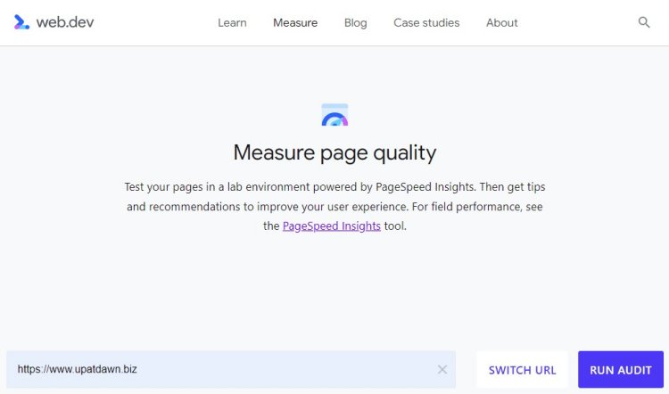
One way of improving your page experience is to improve your JavaScript code and its handling. Want to check on this? One of the tools you can use is on the Measure page of web.dev provided by Google. This tool analyzes your website’s performance, shows you a summary of your website’s scores according to the core web vitals, and offers recommendations on how to improve them.
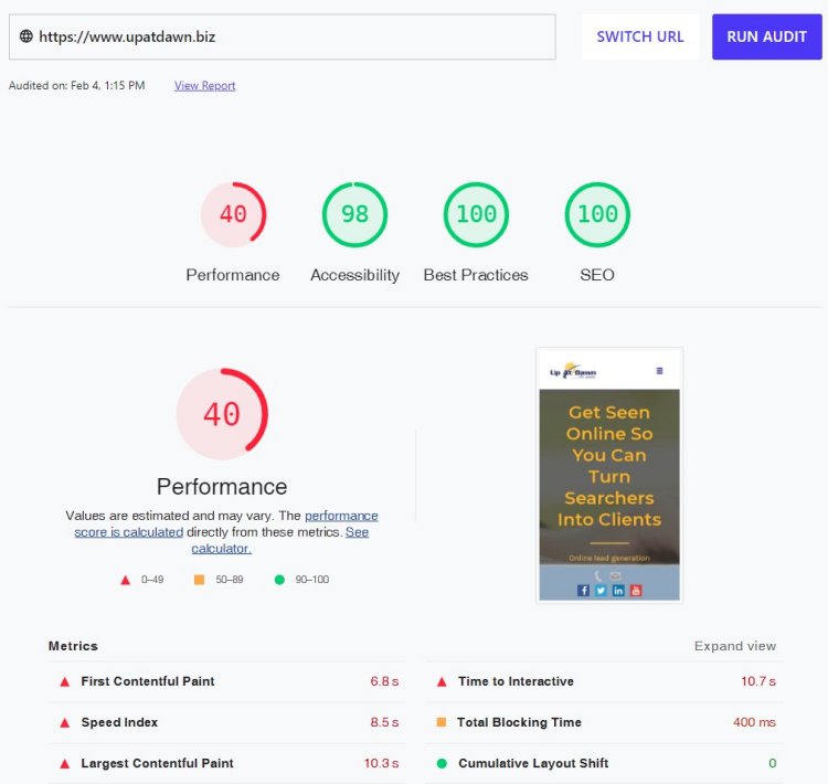
 To use the tool, simply enter your URL and click the Run Audit button like in this screenshot. It will then show you a thorough report of your website based on the core web vitals and what might be slowing its performance. Your goal is to have an overall score of 90–100 if you want to be at the top of the search results.
 In this sample search, we can see 400 milliseconds of total blocking time which is not an ideal score, and the recommendations include reducing unused CSS and JavaScript, among others. We can also see our third core web vital, Cumulative Layout Shift, with a score of 0. And that is exactly the score we want to see for this element!
Cumulative Layout Shift
Have you ever visited a website, where you see a button or link that you are interested in, and just when you are about to click it, that button moves? This is called CLS or Cumulative Layout Shift. CLS measures how much your website content moves around the screen as your page is loading.
CLS compares different frames to determine how often the elements in your site move, and then it calculates the severity of those movements. We can usually see these when loading ads, when reading news, or clicking search and add to cart buttons. According to Google, to provide a good user experience, your site must have a score of less than 0.1. Loading ads on a page will often cause shifts in the layout of your page, especially if those ads are served from an external server.
Another source of layout shift happens when you have a lot of content that is heavy to load, such as larger images, or images with undefined sizes. When your content has images and text, the text will usually appear on the screen first and then the images follow. If the images are not defined with the correct dimensions, the text may appear in one location but then move as the images start to fill in.
If the user starts reading before the images are all present, they’ll notice the layout shift. This experience can be frustrating. So, it’s best to always make sure that you specify the width and height of all images so that the page can render the right size and spacing in the browser. The text can fill in where it should, and the images will load into their predefined spots.
Another way to improve your CLS is to avoid font replacement delays. When you use external fonts, it may take some time to load them when the user first visits your site. So, while the server is loading the external fonts, your site will first show a general system font and then replace it when it’s all loaded. This can impact user experience since your prospect will start reading your content using the general font which then gets replaced by the other font. Changing text size could wrap the lines of the text differently.
And so when the user sees the replacement from general to chosen font, this event is frustrating and is referred to as a flash of unstyled text (FOUT) or flash of unstyled content (FOUC). To help fix these issues, it’s advisable to use no more than two external fonts on your website. And, to get maximum results, test the placement of fonts first so you know how to better optimize the loading time.
While scoring a 100% on your website is important, there are still many variables to consider which help to provide the best user experience and transform traffic into sales. By applying these tips and continually improving your site, you’ll get better performance which leads to better user experiences and higher ranking in the search results as well as happier visitors who are more likely to become engaged with your business.
To learn more about gaining top positions in the search results, please subscribe to my channel. And consider joining me on an upcoming webinar. I’ll put the link here.
Your business deserves to be seen online, and I’ll help you get there. Thanks for watching and have a great day!