[Do you like this? Please subscribe to my YouTube Channel and then share it for me!]
Video Summary
Who is your website for? Is it for you, or is it supposed to be for your prospects and customers?
Most of the time businesses want to have a website that helps them get new prospects and customers. The problem is that they often create a site that appeals more to the site owners than the site users.
Here’s a free tool to help you see what’s going on with your website.
Video Transcript
Hello, I’m Jeffrey Kirk. I’m going to show you an interesting tool today, but first, a bit of an explanation… Did you create your website for yourself, perhaps to have a positive sounding blurb to promote your business?
How many times have you searched for a solution to a problem and you ended up on a website that says, “We do this and we do that.” They just talk about themselves all the time, thumping their chest and building themselves up.
The owners of those websites must feel pretty good when they read their own content, right? The problem is that the reader has a hard time making a connection to businesses that have sites like that. It’s like meeting someone at a business networking event who just goes on and on about how great they are and what they can do for you. You just want to get away to talk to someone else.
Of course, it’s good to know how great a business is, but everyone is more interested in how that business will serve their needs, not what the business has to say about itself or what you have to say about your business. What someone wants when they visit your website is the comfort in knowing that you can help them with the problem that brought them to your site in the first place.
So this can be a fine line of distinction. Because on the one hand, you do have to give them information about your business so they can feel comfortable with your solution. But on the other hand, you have to connect with them where they will hit the back button and move on to another site. Hitting the back button is much easier than getting away from the self-absorbed person at the networking event.
So what’s the secret? Actually, it’s really quite simple…
Stop the WeWe
Just change the we, we, to you, you. Instead of we-weeing all over the place with “we do this” and “we do that”, try “you get this” and “you get that”. You’re rephrasing the words into benefit phrases for your site visitors. It’s much easier for them to connect with your solution and their problem when you tell them the benefits they receive, rather than the things that you offer.
Just so you know, this is also true on e‑commerce sites. If you sell products, you should customize the language in the product descriptions to focus on the benefits to the buyer, rather than just the features that your product offers. Doing this will help your conversion rate.
Wouldn’t it be great if there were a quick test to see how well your web pages are focused on your visitors, your potential customers? Well, you’re in luck! There is such a tool and it’s called the Customer Focus Calculator. I’m going to go to my computer and quickly show you how to use this tool.
Examples Using the Customer Focus Calculator
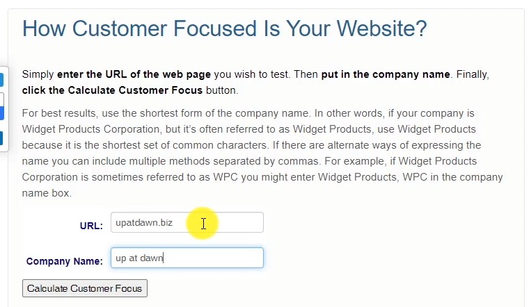
Okay, I’m at my computer and I have the Customer Focus Calculator up in my browser. The website address is customerfocuscalculator.com. And this website is actually very simple to use.
You just come down here where it says URL, and you put in the address of the website that you want to test. We’ll start off. I’ll just take a look at our own site upatdawn.biz. Company name is Up at Dawn. So you just put in the URL of the website, it can be the entire URL with a slash and page name, that’s fine, or you can just look at the homepage.

It’s actually a good idea to test several pages of any given site. And then the next line, the company name, you put in the company name as it’s commonly used and you can use other names. If the page of the site might have an abbreviation, for example, if we call the business UAD, I could just put in comma, UAD or comma, anything else that we would want to have and it would check all those different names simultaneously. We don’t have that. We just have Up at Dawn.
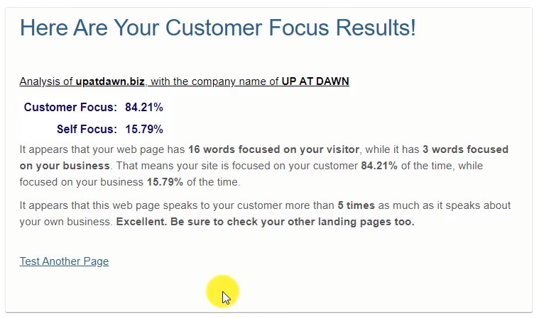
So once you have the URL in there and the company name in there, just click the Calculate Customer Focus button and we’ll see the results. So this tells me that the customer focus is just above 84% and the focus on our own business is just below 16%. And then it breaks it down. It says, “16 words are focused on your visitor, while three words are focused on your business.”

And then it repeats these percentages here. And then it gives a little bit of a summary. In this case, it says, “It appears that this webpage speaks to your customer more than five times as much as it speaks about your own business.” Excellent. Be sure to check your other landing pages too. So it’s reminding you to look at other pages of the site.
Now, if I want to go back, I can click the link down here to test another page. And this time I’m going to look at another business and I’m going to blur it out so that you can’t see it, and so that I’m protecting any other business that I’m mentioning here. So I’ll put in the URL and the company name, and click Calculate Customer Focus. And here are the results for that business.
In this case, the customer focus is around 39%, where the self-focus is around 61%. You have 14 words focused on the visitor and 22 words focused on the business. And again, the percentages are repeated and the description has changed.
It says, “It appears that this webpage speaks about your business more than it speaks to your customer. How can you just wording to focus more on your customers?” So can they shift some of that talking about themselves into talking about their visitors?
Let’s take a look at one more. And this one is actually very typical as to what I see. So let me enter the URL and the company name. And again, I’ll click Calculate Customer Focus, and you can see here, the customer focus is only about 30.5%. And the focus on their own business is about 69.5%.
So they have 18 words focused on the visitor and 41 words focused on the business itself. The description down here, it says, “It appears that this webpage speaks about the business more than two times as much as it speaks to the customer. It’s likely this is having a negative impact on your conversion results. What can you do to shift the focus to your customers?”
So that’s what’s necessary in this case, not just on this site, but for lots of other businesses. This one actually isn’t all that horrible. I’ve seen these where the customer focus is much worse than this. This is pretty typical where customer focus is twice or even three times worse than the self-focused. So it hurts their business.
So now, go try this for yourself. And one more thing, as long as you’re on this site and it’s a free tool, show a little bit of love and click the like button over here.
Hey, thanks for watching my video today. Try out the Customer Focus Calculator and then let me know in the comments below what it revealed to you. Your business deserves to be seen online and I hope this tool helps you succeed. I will see you again very soon and have a great day.